What the chart shows
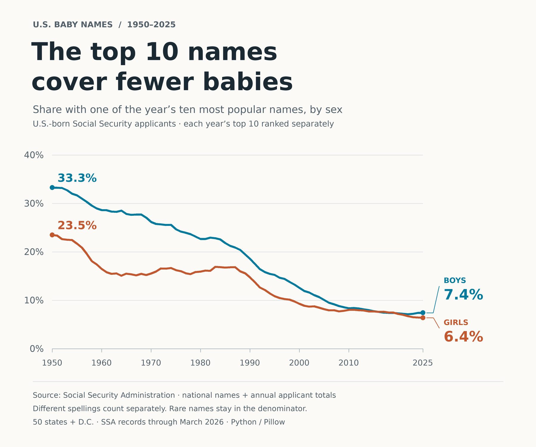
The share with one of each year's ten most popular names fell from 33.3% to 7.4% for boys and from 23.5% to 6.4% for girls between 1950 and 2025.
US-born Social Security applicants in the 50 states and Washington, DC, 1950–2025.
How it was made
Rank names separately for each year and the source M/F sex category. Divide the ten leading name counts by the complete SSA applicant total, retaining rare names in the denominator. Spelling variants remain separate.
Definitions & limits
- These are Social Security card applicants, not a census of all live births.
- SSA records describe the source through March 2026; the fixed snapshot was retrieved on 14 October 2026.
- The chart covers 1950–2025; the companion name and applicant-total files cover 1880–2025.
Original sources
Snapshot date: 2026-10-14. Source releases and observations can be revised; the linked download notes describe this fixed version.